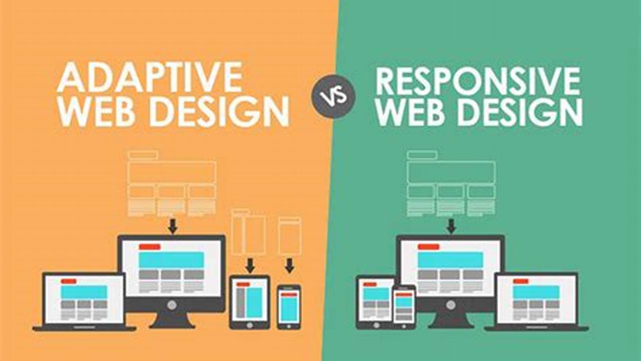
Selecting the optimal web design approach is crucial for ensuring a positive user experience and maximizing online presence. Choosing between a fluid, adaptable layout and one tailored to specific devices requires careful consideration of project goals, budget, and technical expertise. This exploration delves into the nuances of each method, providing guidance for making informed decisions.
Fluid Layouts and Media Queries
This approach uses CSS media queries to adjust styles based on screen size, creating a flexible layout that adapts to various devices.
Device-Specific HTML and CSS
This method delivers different HTML and CSS based on the detected device, offering tailored experiences but potentially requiring more upfront development effort.
Development Time and Cost
Fluid layouts generally involve less initial development time and cost, while device-specific approaches can demand more resources due to the creation of multiple versions.
Maintenance and Updates
Maintaining a fluid layout is typically simpler, involving updates to a single codebase. Device-specific designs may require updates across multiple versions.
User Experience Considerations
Fluid layouts provide a consistent experience across devices, while device-specific designs offer the potential for highly optimized experiences on each targeted platform.
Content Management
Managing content for a fluid layout is straightforward, as a single content source serves all devices. Device-specific approaches might necessitate managing content for each version.
Performance Implications
Fluid layouts can sometimes lead to performance bottlenecks on lower-powered devices if not optimized carefully. Device-specific designs can optimize performance for each targeted device.
SEO Implications
Both approaches can be SEO-friendly when implemented correctly. Fluid layouts benefit from a single URL, while device-specific approaches might require careful handling of canonical URLs.
Tips for Effective Implementation
Prioritize Content:
Ensure content remains the central focus, regardless of the chosen approach. Structure content logically and semantically.
Test Thoroughly:
Rigorous testing across various devices and browsers is essential to identify and address potential layout or functionality issues.
Optimize for Performance:
Minimize HTTP requests, optimize images, and leverage browser caching to ensure fast loading times across all devices.
Use a Mobile-First Approach:
Designing for smaller screens first and then scaling up can improve efficiency and ensure a positive user experience on all devices.
Frequently Asked Questions
What is the best approach for a limited budget?
A fluid layout is often more budget-friendly due to lower initial development costs and simplified maintenance.
Which approach is best for complex web applications?
The choice depends on the specific application requirements. Device-specific designs can be beneficial for highly customized user experiences but require more resources.
How can I ensure my website is accessible on all devices?
Thorough testing across a range of devices and adherence to accessibility guidelines are crucial for ensuring broad device compatibility.
Is it possible to combine both approaches?
In certain cases, a hybrid approach leveraging elements of both fluid and device-specific designs can be effective.
Which method offers better control over the user experience?
Device-specific design offers greater control, allowing for precise tailoring to each target platform.
Which approach is easier to maintain in the long run?
Fluid layouts are generally easier to maintain due to the single codebase.
Choosing the appropriate design strategy requires a comprehensive understanding of project needs and available resources. By considering the factors outlined above, developers can make informed decisions that contribute to creating successful and engaging web experiences.


